
IBM Design Community Platform
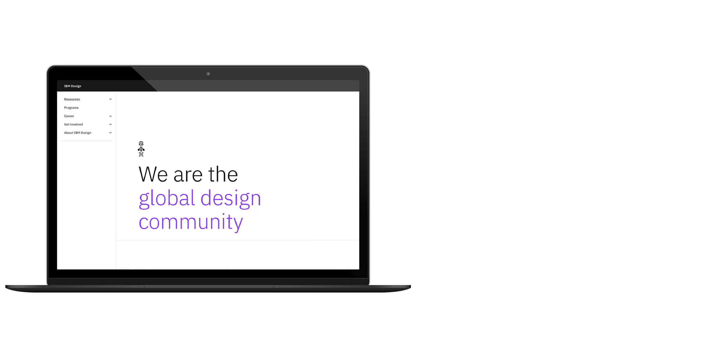
The home for IBM’s global design community (and friends).
Summary
The IBM Design Community Platform is the home of the design community on IBM’s award-winning intranet, w3.ibm.com. The experience activates 2,500+ formally-trained global designers, along with 20K UX professionals, and 200K design thinkers across IBM.
Designers can easily find news updates, announcements, insight into relevant events and initiatives, as well as meet our senior design leaders and see where they’re making impact. The site also provides a mental model for designers and design advocates to understand how design maps across the company, and provides context for how design and designers are essential to the IBM business.
Learn more about the w3 Design Community Platform release on Medium.
Some of the platform content contains sensitive IP and its contents cannot be shared outside of IBM.
User need
The Design Community Platform was born out of a few key pain points that designers experienced, especially at the early and mid-career levels:
Designers lacked visibility and insight into the landscape of design at the company. They needed to understand its scale, its geographical layout, and how both design and designers are embedded across IBM’s business units and technologies.
Designers were missing context for how their work related to our business strategy, and needed deeper understanding of the industry landscape.
Designers had no centralized place for resources related to design practice, community, and design leadership. They were largely relying on word of mouth and “link farms” to catalog and find resources.
Initial user research uncovered sentiments like the one below:
“IBM’s so big and people can feel disconnected from each other—there’s no really good place where I can look for information where it would be helpful.”
- Mid-career designer
This need fueled the formation of the project and the subsequent Design Community Platform, as a gateway for designers to get connected, a source of truth and context. Our site would serve as touchpoint #1, guiding designers to the top resources they need to get their jobs done.
Our goal
The overall goal was simple—create a digital platform where our global design community could stay aligned and connected. We accomplished this goal by tackling a few hills, which have been redacted into statements of intent below.
Our hill statements:
A globally shared design ethos and vision
We seek to align designers across all geographies and business units around the narrative of design at IBM, how design and designers map across the company, and design’s values, mission, and vision.
Preparing designers for the future
We aspire to boost designers’ business acumen and understanding of the industry to equip designers for the future of enterprise experiences.
Elevated design quality by activating leaders
We achieve this by activating our community’s senior leaders, who uphold standards of excellence in practice and performance.
The team
The project lasted 5 months from the planning stage to launch. Our team was comprised of a team lead, a front-end developer, a UX designer who focused on the UI, a part-time visual designer from the brand organization who focused on the visual aspects of the UI, and me, the content design lead. We also had several senior leaders critique and provide guidance for the project along the way, with Vice President and Distinguished Designer, Doug Powell as our executive sponsor.
We leaned heavily on brand leadership to maintain consistency and reflect our design ethos, IBM Design Language. We also frequently collaborated with our design leadership program owners to accurately represent our senior design leaders on our site and to provide critique and feedback.


Our project was the gravitational singularity amassing all design link farms across the IBM business, and sucking them into the void (never to return)! It would then spawn a new, more easily navigable universe.
The experience sits at a tension point between being editorial and informative.
Yet at its core—it’s human.
Contribution
Background
We referred to our project with codename “Project Singularity.” This was created, in jest, for the hypothetical future moment in time when the collective intelligence of machines and technological growth surpasses that of humanity, creating a super-intelligence that drastically changes human civilization. The joke was that our launch was to be the moment when singularity hits for the design community. Of course, this is not rooted in reality, as our design community yields collective intelligence greater than any one website.
Singularity’s other meaning—in the gravitation sense—is when a black hole’s center, or “event horizon” becomes so strong, that nothing can escape, not even light. Our project was the gravitational singularity amassing all design link farms across the IBM business and sucking them into the void (never to return)! It would then spawn a new, more easily navigable universe.
As the lead content designer on the project, I was tasked with the responsibility of wrangling together a giant junk drawer of messy pieces and parts. I was to join together lots of disparate mental models, resources, and information together in a way that made sense for the community at large.
Tone and voice
The design community platform was created using Carbon Design System’s Gatsby Theme. Since Gatsby is traditionally built for documentation sites, one of the greatest challenges with the site was to push the limits of this theme in an innovative way so that it can also serve an editorial purpose. This played out in the the visual design and the content.
As content designer, it was up to me to establish its tone and voice by creating style guide and logging content patterns across the UX. The experience sits at a tension point between being editorial and informative. It is future-looking, inspirational, curated, sophisticated, and expresses a point-of-view. Yet, it is also practical, tactical; acting as a trusted advisor or mentor for the community. At its core, it maintains the tone of being clear, approachable, curious, and representative of our diverse design population. It’s human.
The site marries the point-of-view of the special design team that activates design across IBM—The Design Program Office—and the voice of the design community. As curators, amplifiers, and conveners serving the design community, our team wanted to ensure the site felt like it’s not a tops-down and out-of-touch dead space. We wanted to create a place that was very much living and morphing to meet the practical needs and interests of the community. We achieved just that!
Content design
I began by modeling an outline and establishing a collaboration process. I created content specs across all site pages, and wrote 80% of the site content. Once integrated into the build, I updated and evolved the content along with other site components in markdown. One challenge of the design process was versioning across several collaborators, which was a concern I had from the get-go. For that reason I advise any future project involving more than 3 collaborators to use an innately collaborative tool like Figma, instead of perpetually living in version hell… “The final file is FINAL-FILE-V200.sketch, I promise!” We went through several rounds of editorial review with leaders, and continually created higher fidelity prototypes with fewer words that conveyed the story we wanted to tell, along with the resources our users wanted and needed for their daily work.
Information architecture
The labeling, taxonomy, and navigation of the site were of utmost importance. I conducted a research plan to develop an IA that was based on what I dubbed the “Concensus IA,” that reflected a consensus mental model. The intent of the research was so that designers (and non-designers) must be able to easily navigate all information, programs, practices, and systems relevant to design at IBM to meet their needs through an accessible, IDL and Carbon-compliant, context-rich experience. The research protocol included using open card sorting where users would group site items and name categories, followed by closed card sorting to validate if the results were resonating with users. The new IA was then tested in interviews with designers through obscuring the site content so that only the navigation was visible. What resulted was a simplified IA that enabled our users to understand and navigate our site with more ease.
Stakeholder management
Building this experience required working with stakeholders across the business. In particular for our “Meet the leaders” page, we collaborated with executives across IBM to feature their profiles with high-quality portraits and a way to connect with them. All our Design Technical and Management executives across Product, Services, Operations, and Brand (Design Principal / Director-level and higher) were represented. This created greater visibility for our design community to meaningfully connect with their design-focused leaders. We partnered with executives in brand and services frequently to ensure we were on-message. We also collaborated with all our design practice teams such as Enterprise Design Thinking, AI and Ethics, Accessibility, Carbon, and more.
Content strategy and contribution
We baked the platform into the content publication strategy and community engagement strategy. Initiatives, events, and thought leadership content retain calls to action back to our site to garner even more engagement. And we have developed an in-depth contribution and engagement strategy that allows designers to provide feedback, edit the site directly on GitHub, ask questions or make suggestions on Slack, and create featured content in a variety of formats and mediums.
Communications
Launching an internal project cannot be successful without a communications strategy. Leveraging my skill sets from a past life in marketing, I created a mini campaign strategy for promoting our experience complete with email blasts using MailChimp, engaging Slack messaging and imagery, along with promoting it in other established channels within the design community (like our monthly all-hands series, First Thursday) and beyond at IBM. We first soft launched to small group of executive stakeholders in December of 2019 in order to incorporate their feedback. Our site launch day on January 29, 2020 saw 6.7K page views and 1.6K unique visitors—outperforming similar design sites of its kind.
Impact
After the launch of w3.ibm.com/design, designers feel more in-touch with the community, and finally have one place where they can go to feel connected. They can cut through the noise, get the latest newsworthy content, and find resources that are useful for tackling their day-to-day jobs. Site analytics reported an average of 2K to 3K unique user visits per month, with 26K unique visitors in 2020.
Comparative experiences have received 8K unique visitors per year total as a benchmark, so it is outperforming its competition. We’ve received feedback from the community that it’s their first go-to destination for any design resources they need to get their job done, often traversing there to get the resources they need.
Three months after launch, we conducted research sending out a survey to a representative sample size of 70 designers and design managers across the business to understand what sites and content are most useful and engaging. The top response when we asked the open-ended question, “what internal websites do you visit to find design information like best practices, resources, case studies, and inspiration?” was our site. The top 3 most valuable portions of our site consist of design practices, career resources, and events.
Building this experience was a valuable and engaging convening point for the designers in our business. I learned quite a bit about our business, working in teams, and developed relationships and new skills.