Brand
My career has its roots in visual communication design, so naturally I work on brand and identity projects from time to time. Explore featured projects below.
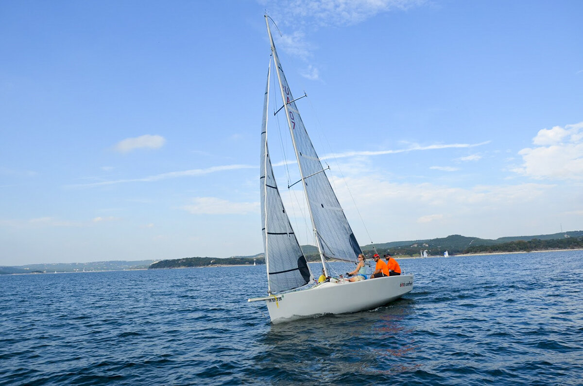
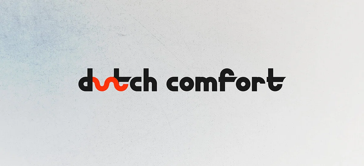
Dutch comfort
In the seventeenth century, the Dutch and British were enemies. Both sought maritime superiority and economic domination, as both had their eye on the East Indies. To the British, the Dutch were the bad guys, and stereotyped them as miserly, bad-tempered, and stingy. Naturally, the Brits captured this contempt in their everyday language. Pejorative phrases that arose from this time include "Dutch courage," or temporary bravery induced by alcohol; "Dutch concert," in which each musician plays a different tune; and "Dutch comfort," an ineffective consolation that things simply can’t be worse than they already are. Really, it is not a comfort at all. For example, if you are a sailor who is beaten in a regatta by a faster boat, your opponent (obviously a Dutchie) might try to console you after the race by turning to you and saying, "at least you didn't die."
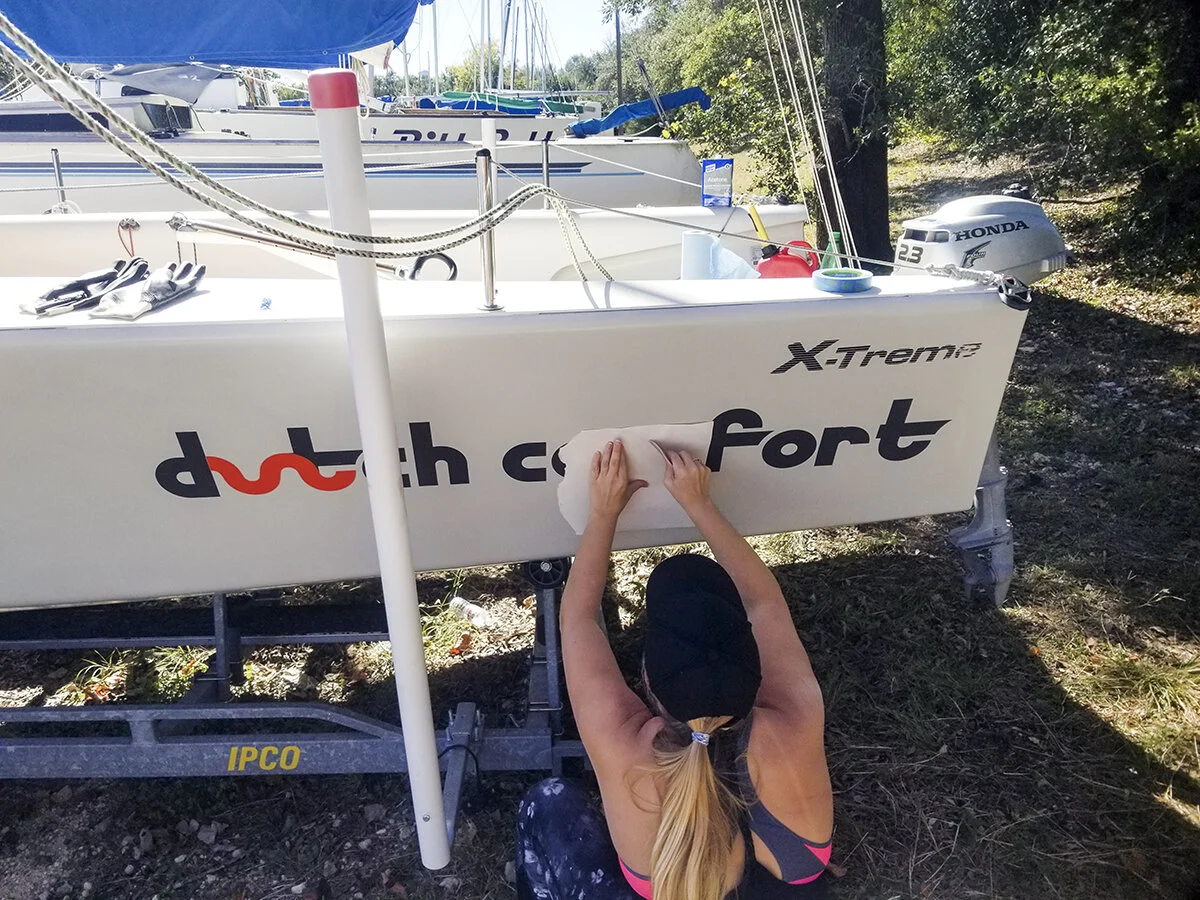
When my husband purchased his racing sailboat, it turned out she's Dutch, just like me. She is a G-Force Yachts X-treme 25, hailing from Groningen, Netherlands (which is the birthplace of my great grandparents). Thus her new name, Dutch Comfort was born. With this branding, I incorporated the official color of the Order of the House of Orange, along with a dark grey for contrast. I created a modern, custom font for the wordmark using shapes that evoke waves and the movement of the North Sea.
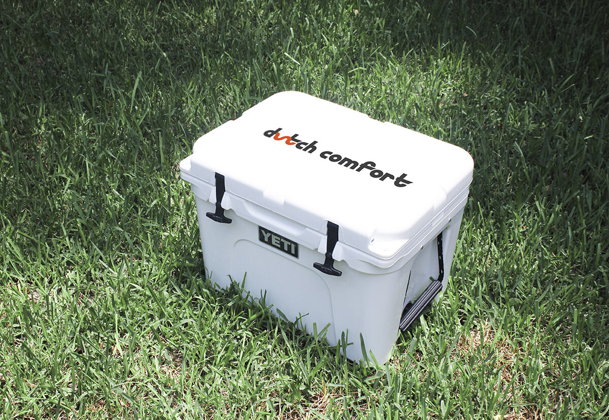
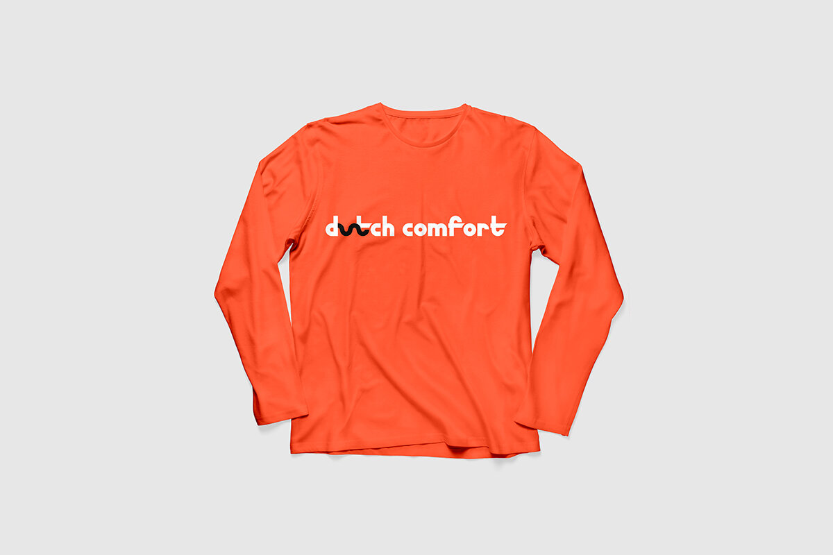
Its branded artifacts stem from vinyl applications on the vessel herself to car vinyls, shirts, hats, yeti coolers, and beyond.